Parameters specifications for multi-column autocomplete
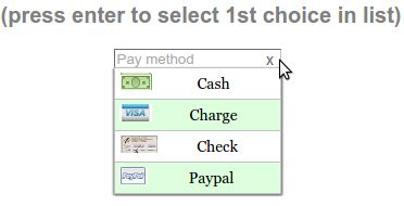
Show me the multi-column autocomplete demo
Parameter list for multi-column autocomplete
| Parameter | Type | Allowable Values | Default | Required |
|---|---|---|---|---|
| ClearBtn | boolean | true or false | true | false |
| ColumnCount | integer | positive integer | 1 | false |
| Data | JSON object | (see Data section) | none | true |
| DataKeyNames | object | (see DataKeyNames section) | none | false |
| Disabled | boolean | true or false | false | false |
| DisableHiLiting | boolean | true or false | false | false |
| Filters | array of objects | {‘str’:’str’} or {‘str’:’RegExp’} | none | false |
| Height | integer | positive integer | height of dropdown | false |
| Help | strimg | ‘right’|’top’|’bottom’ | ‘right’ | false |
| InitialValue | object | {‘ky’|’val’: <value>} | {} | false |
| Justify | string | ‘right’|’left’|’center’ | left | false |
| MenuOptionsType | string | ‘Select’|’Navigate’|’Rocker’ | ‘Select’ | false |
| onSelect | function | function() | none | false |
| PlaceHolder | <deleted> | <as of v1.6.1> | – | – |
| SelectOnly | boolean | true or false | false | false |
| ShowAt | string | ‘Bottom’ or ‘Right’ | ‘Bottom’ | false |
| Sort | array of strings | [‘alpha’|’num’, ‘desc’|’asc’] | [‘alpha’,’asc’] | false |
| TriggerEvent | <deleted> | <as of v1.5.1> | – | – |
| UseValueForKey | boolean | true or false | false | false |
| UserInputAllowed | boolean | true or false | false | false |
| Width | integer | positive integer | width of dropdown | false |
Parameters explained for MenuOption multi-column autocomplete
ClearBtn
options: true or false
ClearBtn instructs MenuOptions to place a clear button on the right side of the <input> element. It will clear that <input> element when clicked and cause the drop down list to appear.
ColumnCount
options: positive integer
MenuOptions defaults to a single column. To show have more than one column, use the ColumnCount parameter.
Data
options: [] or [ [], [], …], {} or [ {}, {}, … ]
MenuOptions accepts the following in Data
- an array
- [“Jan”,”Feb”,”Mar”…]
- an array of arrays
- [[“Jan”,”Feb”,”Mar”],[“Apr”,”Jun”,”Jul”]…]
- a single multikey object
- { 1:”Jan”, 2:”Feb”,…}
- an array of multikey or single key objects
- single key [{1:”Jan”},{2:”Feb”}…]
- multikey [{1:”Jan”,2:”Feb”},{3:”Mar”, 4:”Apr”}…]
- an array of multikey objects where keys are specifed and extracted
- (see DataKeyNames)
- Notes:
- Use arrays when you want the menu_opt_key to equal the displayed text, e.g., when using US State abbreviations. So the display would be ‘AL’ (for Alabama) and ‘AL’ would be stored in the menu_opt_key
- Use objects when you want to save a code in menu_opt_key For example, if you want to display ‘January’ but save the code 1 in the menu_opt_key (and later save that code in a database or other persistent storage).
DataKeyNames
options: { “key”: <key name>, “value”: <value name> }
DataKeyNamesallows you to utilize Data that has extra, unneeded data, only picking out the key and value fields that you specify.Below is the code used in Quick start multi-column autocomplete
var data = [{"mon_num":1, "mon_name":"January", "junk_key":"junk_val"},
            {"mon_num":2, "mon_name":"February", "junk_key":"junk_val"},
            {"mon_num":3, "mon_name":"March", "junk_key":"junk_val"},
            {"mon_num":4, "mon_name":"April", "junk_key":"junk_val"},
            {"mon_num":5, "mon_name":"May", "junk_key":"junk_val"},
            {"mon_num":6, "mon_name":"June", "junk_key":"junk_val"},
            {"mon_num":7, "mon_name":"July", "junk_key":"junk_val"},
            {"mon_num":8, "mon_name":"August", "junk_key":"junk_val"},
            {"mon_num":9, "mon_name":"September", "junk_key":"junk_val"},
            {"mon_num":10, "mon_name":"October", "junk_key":"junk_val"},
            {"mon_num":11, "mon_name":"November", "junk_key":"junk_val"},
            {"mon_num":12, "mon_name":"December", "junk_key":"junk_val"}];
$('input#selecttest').menuoptions({
    "Data": data,
    "onSelect": function(mo, data) {
        console.log(mo, data.newVal, data.newCode, data.type );
    },
    "DataKeyNames" : { "key": "mon_num", "value": "mon_name" },
    "ClearBtn": true,
    "InitialValue": { 'val': 'December'},
    "ShowAt": 'bottom',
    "Sort": []
});
$('input#scrolltest').menuoptions({
- Notes:
DataKeyNamesrequires that Data be an array of objects [ {}, {}, … ]
Disabled
options: true or false
default: false
Setting Disabled to true will make the MenuOptions control disabled.
Setting Disabled to false will make the MenuOptions control enabled.
Note:
- Setting Diasbled to true will disable the parent <div> of the MenuOptions control. If you placed another element in that same <div>, it will disabled as well To get around this, put the other element outside the <div> containing the MenuOptions control.
DisableHiLiting
options: true or false
default: false
There are 3 conditions that will cause the background of an MenuOptions input element to change to pink (indicating incomplete or error).
- the user type in an invalid character (i.e., a character not in the multi-column autocomplete).
- when leaving the MenuOptions input element (blur event) and the value is incomplete.
- when using setting the intial value (using InitialValue) and that initial value is invalid
Set to true to disable this feature.
Filters
options: [ { ‘text : ‘text’ }, …] or [ {‘text’: ‘RegExp’}, …]
Filters enable mouseover filtering of multi-column autocomplete items You can filter by plain text or by regular expression (Example of using Filters with a RegExp )
'Filters': [{ 'Biz' : '^(CNBC|MarketWatch)'}, {'Search' :'^(Google|Yahoo)'} ],
Height
options: positive integer
MenuOptions will default to the actual height of the multi-column autocomplete list. Using the Height parameter is useful to get the exact height you want for your application. It is also useful for large list, since it will create a vertical scroll bar. (Example of using Height to create a vertical scroll bar )
'Height': 200
Help
options: right|top|bottom|None
You can specify one of three positions to show help (and error) messages
Notes:
- the default is ‘right’ (the other psoition options are ‘top’ and ‘bottom’).
- Use ‘None’ to suppress all help messages.
$('input#YMDtest').menuoptions({
    "onSelect": function(mo, data) {
         console.log(mo, data.newVal, data.newCode, data.type );
     },
    "ClearBtn": true,
    "Help": 'bottom' // or 'top' or 'right' or 'None'
});
InitialValue
options: { ‘ky’ or ‘val’ : <value> }
You can use InitialValue to set (or reset) an initial value.
Note: you can use this to set the initial value (visible on the screen) or to set the key (the menu_opt_key) or both key and value. (see a demo that uses InitialValue )
These examples show using both forms of InitialValue
'InitialValue': { 'val':'Sicilian' },
'InitialValue': { 'ky': 1 },
Note: InitialValue can only be used at initialization time.
To reset the value after that time, use set_select_value
Justify
options: left|right|center
This will justify the text in the input element
"Justify": 'right',
MenuOptionsType
options: ‘Select’ or ‘Navigate’ or ‘Rocker’
MenuOptions defaults to “Select”. To create a menu drop down, call menuoptions with MenuOptionsType = “Navigate”. To create a Rocker control, call menuoptions with MenuOptionsType = “Rocker”
'MenuOptionsType': 'Navigate'
onSelect
options: function(<MenuOptions instance>, data)
When user selects an option, either by clicking or by pressing enter while in the text box, this function will be executed
data has 3 values
- newVal (the new value that was selected)
- newCode (the code that corresponds to new value that was selected)
- type (this tells you if the selection was made by “Click”, “EnterKey” or “RockerClick”)
"onSelect": function(mo, data) {
    if ( data.type == "EnterKey" ) {
        $("form#tst").submit();
    }
    console.log(mo, data.newVal, data.newCode, data.type );
},
PlaceHolder
<deleted> as of version 1.6.1
Due to the whimsical nature of IE, (triggering an input event when placeholder is changed), this feature was removed
SelectOnly
options: true or false
This makes the <input> element read-only, i.e., data can only be entered by clicking a multi-column autocomplete item (note: this prevents the use of autocomplete).
ShowAt
options: ‘bottom’ or ‘right’
MenuOptions accepts a string to tell it where to display the multi-column autocomplete items
"Bottom" means that the multi-column autocomplete list will appear underneath
"Right" means that the multi-column autocomplete list will appear to the right
Sort
options: [‘alpha’ or ‘num’, ‘desc’ or ‘asc’]
Setting the property to an empty array will cause a Data array (or array of objects) to be displayed in the original order. With no sort, a single object will be displayed in random order.
UseValueForKey
options: true or false
UseValueForKey = true means that the visible option will be the same as the menu_opt_key. So if the visible option were “CA”, the html built would look like:
<td menu_opt_key="CA">"CA"</td>.
UserInputAllowed
options: true or false
UserInputAllowed = true means that the user can type in anything OR can choose an autocomplete item from the list (see a demo that uses UserInputAllowed )
Notes:
- user input will return with a key value of -1, so this is advisable when you are saving user text and not key value codes. An example might be where you present the user with a list of names but want to allow them to add a new name.
- User will get a warning saying “no list matches” when they type in text not in the autocomplete list
- cannot be used with masks
Width
options: positive integer
MenuOptions will try to match the width of the parent element (it may be wider if the contents cannot fit). The Width parameter allows the user to override the default width.